The Poster...
|
|
| ||||||
The Graphic Novel...
Graphic Novels are probably the epitome of good graphic design - and one of the greatest challenges for the designer - yet one of the most under rated forms of visual communication. The creation and design of a graphic novel will challenge every single tool you have at your disposal as a graphic designer.
Some of the high points in the writing and design of graphic novels are...
The Watchmen (by Alan Moore and Dave Gibbons)
Maus (by Art Spiegelman)
Persepolis (by Marjane Satrapi)
The Sandman (by Neil Gaiman)
Some of the high points in the writing and design of graphic novels are...
The Watchmen (by Alan Moore and Dave Gibbons)
Maus (by Art Spiegelman)
Persepolis (by Marjane Satrapi)
The Sandman (by Neil Gaiman)
Graphic Novels are in interesting challenge for the designer because you have to juggle multiple objects - each incredibly important.
As a designer, each individual panel needs to be well designed, have a focal point, balance, good use of negative space and tell a story through images (and possibly words). In addition, the page needs to be well designed using the same considerations, as well as the additional layer of complexity that requires each panel to work together on the page to advance the narrative.
Add to that the visual language of the panels, the language and symbolism of the gutters and other tertiary elements, and the idea of the passage of time being shown visually by sequential images and you have a highly complex form of visual storytelling through design.
The of course, there is the writing, what will be explained through words and what will be communicated through pictures, what will be spoken dialog, what will be narration ( and will it be first person or third) and what will be thoughts instead of spoken words - and most importantly, why are you making each of those choices).
|
Below is Part 1 of your Frank Miller style graphic novel tutorial.
Below please find Part 2 of your Frank Miller style graphic novel tutorial.
|
| ||||||
The Comics Code Authority and censorship...
The Comics Code Authority was formed in 1954 by the Comics Magazine Association of America as an alternative to government regulation, to allow the comic publishers to self-regulate the content of comic books in the United States. Its code, commonly called "the Comics Code," lasted till the early 21st centruy. The Comics Code Authority's formation was the result to a series of Senate hearings and the publication of psychologist Fredric Wertham's book Seduction of the Innocent.
Members submitted comics to the CCA, which screened them for adherence to its Code, then authorized the use of their seal on the cover if the book was found to be in compliance. The CCA was a de facto censor for the U.S. comic book industry.
Check out the actual code here at the bottom of the page...
American Paper Currency re-design...
American Paper Currency - something we all have in our pockets, and something we handle every day. But how often do we actually look at what it is were handling, at least from an aesthetic and design point of view? Not that often (in fact, in this professors humble opinion, not often enough as we have some of the ugliest currency in the world).
How often have you actually looked at the bill and asked yourself why it looks the way it does? Why is it the size it is? What do those symbols mean? Whats the point?
That's what we will be exploring in this unit of study - the bill as a narrative device, a symbolic device and a practical tool. And, hopefully, creating something a bit more attractive while we maintain its usefulness.
Remember as we embark upon this adventure, the rules we discussed about reproducing money, and the link to the Secret Service website above. Please, please, please - under no circumstances, scan or color copy a piece of money, nor download a high res image from anywhere online!
|
|
|
| |||||||||
Book Cover Design...
|
How do you create the file size for your book cover?
|
How do you "load the file" with images for your book cover?
|
Magazine Print Ad (The Absolut Vodka ad)...
Package and Label Design...
Simply defined, package design is the discipline of creating the container, graphics and visible outer presence of a product a consumer buys at retail or might receive in the mail. This container may range from a simple bottle and label to an elaborate box or system of boxes and inner packaging.
In today's competitive market place, it's harder than ever to attract a consumer's attention. It's estimated that the average consumer spends less than a second scanning shelves, and in that time, will make a decision on whether or not to purchase any given product. Although graphic designers and others might dabble in it, the three-dimensional nature of package design separates it from other creative disciplines.
In today's competitive market place, it's harder than ever to attract a consumer's attention. It's estimated that the average consumer spends less than a second scanning shelves, and in that time, will make a decision on whether or not to purchase any given product. Although graphic designers and others might dabble in it, the three-dimensional nature of package design separates it from other creative disciplines.
|
|
|
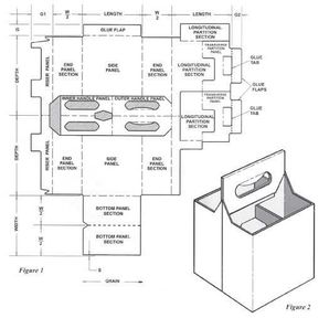
The die-line is the template for a package.
It’s a flattened outline of the cut-lines and folds.
If you took apart a cereal box and flattened it out, you’d be looking at the die-line. The edges of the box are the cut-lines and all the seams and creases are the folds and overlaps. Think of it like origami for products.
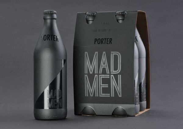
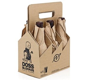
Your task will be to redesign the label and the carrier for a current beer (or hard cider... or any MALT beverage) - wine doesn't count - that's a whole different animal.
It’s a flattened outline of the cut-lines and folds.
If you took apart a cereal box and flattened it out, you’d be looking at the die-line. The edges of the box are the cut-lines and all the seams and creases are the folds and overlaps. Think of it like origami for products.
Your task will be to redesign the label and the carrier for a current beer (or hard cider... or any MALT beverage) - wine doesn't count - that's a whole different animal.
| cbc-100_6_pak_template.pdf |
